Explained: IRCTC now has a new website, here are all the ways it is different from the old version
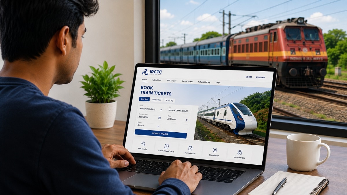
IRCTC has launched a new website refresh for Indian users. The website, now available to all users in beta, boasts new features and upgraded under
IRCTC has launched a new website refresh for Indian users. The website, now available to all users in beta, boasts new features and upgraded under the hood changes to make ticket-booking more seamless. Interestingly, the new website was created and pushed out after students complained about it to India’s Minister for Railways, Information & Broadcasting and Electronics & Information Technology, Ashwani Vaishnaw. The major complaint was that the old IRCTC website was buggy. Vaishnaw on his part had asked IRCTC to launch the new website, free of any issues, by July 15. IRCTC delivered the new website on schedule, at sharp 9PM on July 15, 2026. Read Full Story So, what has actually changed, and do those changes make any difference to the overall experience? India Today Tech will tell you in this writeup. Old IRCTC website recap If you have ever tried to book a Tatkal ticket, you already know. The old IRCTC website struggled under pressure. During peak booking windows, when lakhs of users would rush to book tickets within the same 60 seconds, the system would buckle. Pages would freeze, payments would get stuck, and seats would disappear before the booking even went through. The old platform could handle around 32,000 ticket bookings per minute, which sounds like a lot until you consider how many people are trying to book at the exact same moment.
Beyond the capacity problem, the experience itself was cluttered. CAPTCHA checks would pop up mid-booking, flashing banners competed for your attention, and checking seat availability meant toggling between classes one by one. If you wanted to see whether Sleeper, AC 3 Tier, and AC 2 Tier were all available on the same train, you had to check each one separately. It was tedious, and it cost people bookings. New IRCTC website, what’s new and different? The redesigned website, now live in beta at makes four core improvements that address the most common frustrations. The first and most immediately noticeable change is the removal of unnecessary interruptions. No unnecessary CAPTCHAs, no pop-ups, no flashing graphics. The booking flow is cleaner from start to finish, which matters most during Tatkal windows where every second counts. The second change is unified seat availability. Instead of checking each class separately, the new website shows seat availability across all classes, Sleeper, AC 3 Tier, AC 2 Tier, and others, on a single screen. It is a small change that saves a surprising amount of back-and-forth. Third, the new website reduces the number of steps required to complete a booking. Frequent travellers can save passenger details, which makes repeat bookings significantly faster since you don't have to fill in the same information every time.
 The BriefWire